By Bhakti Bania
Details matter. And as we settle into our new headquarters, I’m enjoying the attention we paid to every last one.
Here are six of my favorite details in our new HQ:
1. The best space is accessible to all. Our penthouse, if you will, includes incredible 15-foot ceilings and giant arched windows teeming with natural light. So instead of making it C-suite offices or even a conference room, we made it our team living room—a comfy, casual space for anyone to use anytime (or, as we’re learning, all the time).
2. Past + present = perfect. Our building, The Schlee-Kemmler, was constructed in 1895 as a brewery office and insurance agency. It has housed a variety of tenants since, including a saloon, a café, a taxicab company, a public hall and a furniture company. As we deconstructed its interior, we found stunning original hardwood floors beneath bad carpet and a beautiful, ornate tin ceiling hidden by low-hanging drop ceilings. We carefully restored both to their former glory, and added more details befitting of the vibe, like custom bookshelves by Edgework Creative.
3. Our values are everywhere. We believe that culture is key to any successful company, ours included. So in our new space, we literally spelled ours out on various walls around the building. (Shout out to TENFOLD for their amazing work to help us articulate those values!) My personal favorite because it’s meaningful but also fun: One elevator wall says, “Eye to Elevate,” which is a reminder that we’re always looking to elevate design and each other.
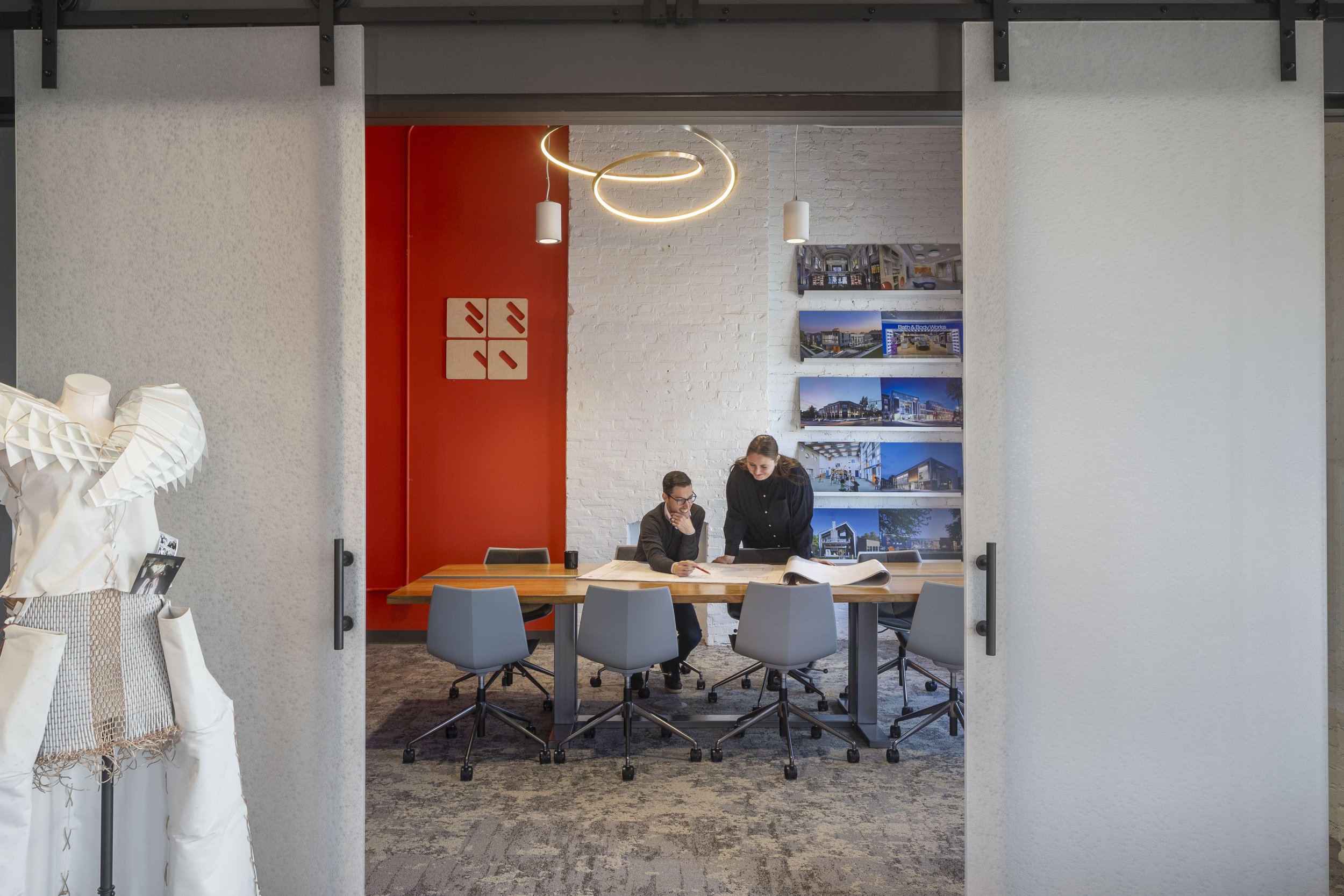
4. We encourage casual collaboration. Yes, we have a formal conference room, because sometimes, that’s the most appropriate space for clients. But we focused on creating several casual collaboration spaces where our team members are comfortable working together whenever needed—no room reservations required. I especially love the meeting space with a barn door that opens into the kitchen, because this team definitely likes our food.
5. We added calming color. There is a vestibule leading to the living room. We painted it green—a color known to be calming. We wanted to subtly set the tone for people as they enter that space.
6. The bathrooms are a blast. We decided to go all in on playful restrooms, so each of the four is one of our four brand colors—red, blue, yellow and gray. From tiles to paint, they are monochromatic and cool. It’s like a choose-your-mood break!
Bhakti Bania is CEO of BBCO, a Columbus, Ohio-based architecture firm that has designed hundreds of dynamic projects worldwide—including mixed-use multifamily housing, student housing, early childhood development centers, STEM facilities and international retail stores.


